To understand why visitors fail to complete a key action on a website, teams often turn to session recordings. They show how an individual visitor interacted with a page: where they clicked, what they scrolled through, where they stopped, and when they left.
These recordings are good at showing what happened. The problem begins when a team tries to use the same actions to determine why it happened.
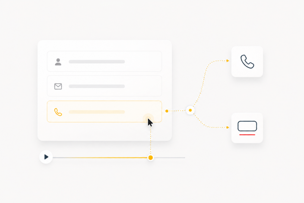
Imagine a website is getting traffic, but few visitors submit the inquiry form. Session recordings reveal a recurring pattern. A visitor starts filling out the form, reaches the phone number field, and leaves the page.
The reason seems obvious. The visitor does not want to speak to a sales manager.
The team considers several solutions. They could make the phone number optional, shorten the form, or offer a messaging option instead. Any of these changes might improve the result. But the recording still does not prove that the visitor left because of the prospect of a phone call.
The field may not have worked correctly on a particular device. The expected phone number format may have been unclear. In other cases, the uncertainty begins after the form is submitted. The visitor does not know who will contact them or what will happen next.
Baymard’s usability research shows that users enter numerical information in different formats, even when formatting examples are provided. If a phone field handles those variations poorly, hesitation or a validation error can become a barrier on its own.
Source:
Baymard Institute — Consider Using Localized Input Masks for ‘Phone’ and Other Restricted Inputs
The team sees the point where the visitor leaves and comes up with several possible explanations. The mistake happens when one of them is treated as the established cause and immediately turned into a task for a designer, developer, or marketer.
The main risk:
the team sees what a user did, explains the reason on its own, and starts fixing that explanation before the hypothesis has been tested.
This is particularly easy to believe because a recording feels much more concrete than conventional analytics.
Why a recording can feel like an explanation
A funnel shows the stage where users drop off. A session recording lets the team inspect an individual visit almost frame by frame. You can see scrolling, clicks, navigation between pages, and interactions with forms.
That level of detail creates the impression that the user’s behavior has already been explained.
Microsoft Clarity, for example, describes session recordings as visual reconstructions built from page content and user actions such as clicks, taps, scrolls, and page visits. This can help locate the exact moment where a user encounters difficulty. But the sequence of actions still does not explain the person’s motive by itself.
Source:
Microsoft Clarity — Recordings overview
Imagine a visitor switches between pricing plans several times, returns to a previous option, reads the descriptions again, and then closes the page.
The team connects the exit with price. The obvious response is to introduce a discount, add a special offer, or explain the price in more detail.
But there may be another explanation. Perhaps the plans are simply difficult to compare. One package is described through features, another through benefits, and a third through limitations. The visitor has to keep several long descriptions in mind just to understand the differences.
They leave before they have even had a chance to evaluate the price. A discount would make the offer cheaper, but the decision-making process would remain just as difficult.
The recording supports both interpretations. The tool itself cannot tell the team which one is more accurate.
Additional research is not always necessary, though. Sometimes the problem is directly visible in the interface.
When a recording provides enough evidence to make a change
Not every observation requires a separate user study.
The recording shows a reproducible barrier: a button does not respond, a field clears entered data, a pop-up blocks the primary action, or the mobile version prevents the user from completing the flow.
The recording shows an action, while the possible reasons involve expectations, trust, price, or perceived value. In this case, the explanation is still a hypothesis.
The first category also includes some less obvious interface problems. For example, users may repeatedly mistake an element for a button, overlook an important action, or return several times to the same navigation block.
If the pattern repeats, the team can check whether it is caused by the interface and justify a local change without conducting a full study of user motives.
But when the possible explanations involve expectations, trust, or perceived value, the observed action is not enough. You may see that a person did not submit the form, but you cannot know with confidence whether they feared a phone call, did not understand the next step, saw too little value in the offer, or simply decided to come back later.
By the same logic, leaving a pricing page does not prove that the price was too high, and returning to the first screen does not automatically mean the headline was weak.
Session recordings help identify obvious interface barriers and areas that require further diagnosis. Whether another research step is necessary depends on whether a repeated behavior can be connected to a specific obstacle without guessing what the user was thinking.
The risk appears when a team does not make that distinction and turns an interpretation directly into a task.
How a plausible explanation turns into unnecessary work
Teams rarely have time to investigate every drop in performance in detail. The business needs a plan, specialists need a concrete task, and the project needs to keep moving.
“The form is too long” immediately suggests a solution. Fields can be removed, rearranged, or combined.
Admitting uncertainty makes the next step harder. The team now has to check the technical side, review other recordings, look at customer questions, and consider several possible causes.
Existing concerns inside the company also influence interpretation. If the team is already questioning traffic quality, short sessions start to look like evidence of irrelevant traffic. If management is worried about pricing, exits from the pricing page start to confirm that prices are too high. If a redesign is already planned, user difficulties become another argument for rebuilding the entire interface.
This is where the distinction between quantitative and qualitative data becomes useful. Quantitative methods are better at showing scale and frequency, while qualitative methods are better suited to understanding why a problem occurs and how it might be fixed. The right method therefore depends on the hypothesis being tested, and a single observed event is not always enough to support a conclusion.
Source:
Nielsen Norman Group — When to Use Which User-Experience Research Methods
The explanation a team chooses determines what happens next. Doubts about traffic quality send marketing back to the advertising campaigns. A pricing hypothesis leads to changes in the offer. A suspected form problem becomes a task for design and development.
Each decision looks rational because it matches the diagnosis.
The team prepares designs, implements the changes, and waits for the result. The numbers barely move, so another explanation appears. A pop-up is added to the already shortened form, a different advertising campaign is launched, or a discount is introduced.
The original barrier may remain untouched the entire time.
The cost of the wrong hypothesis:
the company pays for a change that does not affect the user journey. Specialists spend working hours on it, other tasks are delayed, and paid traffic continues to send visitors into the same unresolved problem.
Large changes are especially expensive. A full redesign can make a website look more modern while preserving the same problem in a specific user flow. The new version may be cleaner and more polished, yet users still stop at exactly the same point.
Before starting the work, it is worth checking both the problematic part of the journey and the logic the team used to assign a cause to it.
How to test a hypothesis before implementation
Start by describing the observed behavior as precisely as possible.
People do not want to provide their phone number.
Users who start filling out the form often stop after reaching the phone number field.
The next step can be broken into four stages.
Form alternative explanations
The field may fail on some devices. The expected phone number format may be unclear without an example. Some visitors may be worried about receiving an unwanted call. Others may not yet see enough value to share their contact details.
Considering several explanations reduces the risk of the team becoming attached to its first guess.
Choose how to test each explanation
A technical issue can be checked across devices and browsers. A recurring behavior can be compared across other recordings and the wider funnel. User expectations can be compared with the questions customers ask sales or support teams.
Each explanation needs the right source of evidence. Watching more recordings will not reveal what someone expects after submitting a form if that expectation never appears in their actions.
Look for a pattern
One striking session can attract attention but still be an exception. The visitor may have been in a hurry, opened the page by accident, or encountered a rare error.
It is more useful to group recordings around a specific scenario. For example, the team can review sessions with the same exit point, device type, traffic source, or funnel stage.
This helps distinguish a recurring barrier from an isolated case.
Define the expected outcome in advance
Suppose users are being stopped by uncertainty about what happens after submitting the form. In that case, a clear explanation of the next step near the button should affect the number of completed submissions.
If pricing plans are difficult to compare, a clearer structure should make the decision easier and increase the number of users moving to the next action.
The success criterion should be defined before implementation. Otherwise, the team risks evaluating the work mainly by whether the change was delivered rather than whether it solved the problem.
Some hypotheses can be tested technically or through additional data. But when the question involves a person’s expectations or motives, observing the interface may not be enough.
When user testing is useful
A session recording shows what a person does without their commentary. In a usability test, a participant is given a realistic task and asked to verbalize their thoughts and expectations as they work through it.
For example, they may be asked to choose the most suitable pricing plan and submit a request for a consultation.
The facilitator does not guide them through the interface. Instead, they observe where the participant hesitates, which elements they believe are interactive, what information they look for, and what they expect to happen after clicking a button.
This can uncover explanations that cannot be confidently reconstructed from cursor movements alone. One participant may expect the form to request payment details immediately. Another may not understand the difference between the plans. A third may postpone the inquiry because they do not know who will call them or when.
The think-aloud method is designed to connect a participant’s actions with the way they interpret the interface and what they expect at a particular moment.
Source:
Nielsen Norman Group — Thinking Aloud: The #1 Usability Tool
A few tests do not provide a statistically complete picture of the audience. They help uncover barriers and explanations the team may not have considered.
In practice, conclusions usually come from a combination of session recordings, funnel data, technical checks, and signals from users.
When users repeatedly stop in the same place and seemingly logical changes fail to improve the result, it is worth delaying the next implementation until the original hypothesis has been checked. This reduces the risk of spending resources on a solution that sounds convincing inside the team but does not improve the user experience.
What to do after testing the hypothesis
Testing the hypothesis helps define the real scope of the task before the team starts spending resources on implementation.
Sometimes the problem is limited to a single field, button state, section label, or another local element. In that case, there is no reason to rebuild the entire user flow.
In other cases, several difficulties are connected. Users may struggle to find the right information, compare options, or understand what to do next. Local fixes may not be enough, and the interface may require more substantial changes.
Once the hypothesis has been tested, it becomes easier to determine the appropriate scope of the solution. That may mean a local interface change, a redesign of a specific user flow, or a complete website redesign.
Cause first, solution second:
the scope of the work should be determined by the actual problem, not by the first explanation that seemed convincing.
If solving the problem requires design and development, El Pixel can implement changes at the appropriate scale. We work on individual interface elements and user flows as well as comprehensive product redesigns.
Related:
Why website redesign costs vary and what you’re actually paying for →